Make Infographics for Everyone
Not a designer? No problem. Make accessible and professional infographics or any other visual you can think of in just a few steps. Start now!
Sign up for free

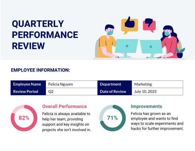
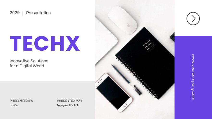
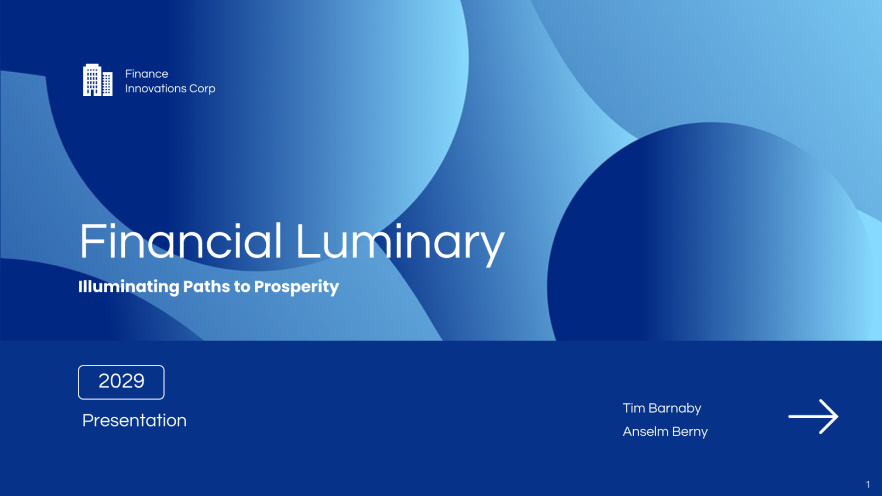
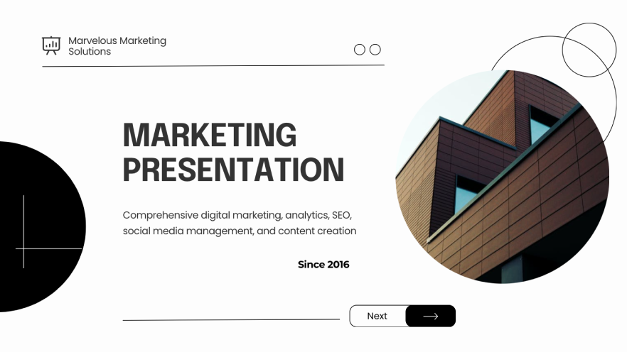
Infographic Templates
Need some inspiration? Explore our most popular infographic templates and start with a professional canvas.
Transform your dull documents, dry data and confusing communications into engaging infographics with business-approved templates and AI-powered editing tools. Get started with Venngage’s infographic maker today.
Set your business communications apart with professionally designed WCAG and ADA compliant infographic templates.

Capture, engage, and retain your audience with stunning infographic templates, created by our team of graphic designers weekly. Make any infographic template your own, regardless of design skill.
See More Templates
Make stunning infographics in 3 simple steps
Your stunning design is only 3 simple steps away
You don't need a fancy design degree to make professional infographics. Share your ideas visually and set your communications apart. Start now for free.
No experience required to start creating beautiful graphics that will set all your future communications apart. Start now for free.

Explore thousands of professional templates
Pick a pre-made infographic template or create your own with the AI design generator. No matter what you want to convey, you’ll find a template to get the job done and then some.

Create within the simple but powerful editor
Jazz up your design with AI-generated text improvements, beautiful illustrations, photos and charts. Take your “pic” from 3+ million stock photos and 40,000+ icons.

Download or share designs with your team
Download and share your designs as PDFs, PNGs, and PPTXs or invite your team to collaborate on the creation process. Get feedback, get aligned, and get results.
There’s a lot to love about Venngage


Dr. Amanda Sterk
Founder of College UnMazed

Saved $100k in total design costs and earned $30k+ in extra income
“Whether I needed visuals saved as PNG for social media, a PDF for a presentation, or any other file type, Venngage facilitated it with a few clicks.”
Read Case Study on How Amanda Sterk Turned Stuffy Content into Beautiful Infographics with Venngage Read Case Study

Pete Dziedzic
COO at Life Insurance Strategies Group

2x their revenue and gained a significant increase in referral business
“Venngage is much more than just an infographic maker, it's the go-to content creation tool.”
Read Case Study for “Venngage is much more than just an infographic maker, it's the go-to content creation tool.” Read Case Study

Vera Aroca
Head of Marketing Communications at ChadSan

Grew page views by 75% and Twitter following by 64%
“Growing our audience with [visualized] content has impressed my team, and given me quite a bit of confidence as a marketer.”
Read Case Study on How ChadSan uses Infographics to Grow its Audience Read Case StudyTrusted by


Supercharge creativity with AI
Take your designs to the next level and make it accessible with AI at your side.

AI-Infographic Generator
Simply enter a prompt or add chart data and witness the magic as your infographic gets created. Customize your design further, adding professional finishing touches.

Improve your content
Elevate your content effortlessly with tailored recommendations. With the “Improve text” feature, instantly improve your message and tone.

AI-Generated Alt Text
Auto-generate accurate descriptions for complex charts, tables, images, and maps. Make your content visually accessible without additional effort.
Simple yet powerful design - perfect for all skill levels
Simple but powerful features - perfect for non-designers
Whether you’re creating visuals on your own or working with a team, you can count on us to help you create the best design to communicate your ideas.

Accessible Editor and Templates
Venngage's drag-and-drop editor comes with accessibility features baked in. Set alt text, check color contrast ratios, edit the reading order or add accessible tables, charts and more from one place. You’ll also get access to accessiblity tools like a Color Blind Simulator!
You can also customize accessible templates by adding or removing elements. To get started, pick an accessible template from our library.

AI-Powered Design Tools
Save valuable time with Venngage’s AI-driven features. Integrated throughout the editing experience, effortlessly transform written prompts and raw data into captivating visuals with the Infographic Generator.
Tweak your content with the Improve Text feature and generate descriptions of images, maps, and charts with AI-based alt text.

Branding and Collaboration
Get everything you need to stay on brand and collaborate with your brand mates, right in the editor. Upload your company logos, colors and fonts to create a custom brand kit.
Add these elements to your designs with a click and add your coworkers to your account, too!

Smart Diagram Features
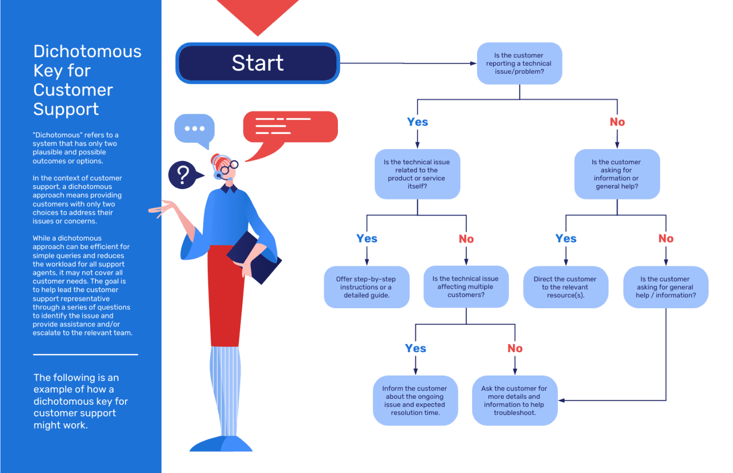
Now you can easily visualize ideas with diagrams, flowcharts, mind maps and more — and this time, actually make them engaging.
Venngage's smart editor auto-resizes diagram shapes as you add, edit or remove text, and you can easily copy and paste shapes and styles in a few clicks.

24/5 Priority Support
Need some design support? We're here to help with any and all questions. Our support team is available around the clock, so your team can keep working like clockwork.
Connect with our support team through chat, phone or email any time, and we'll be happy to answer your questions and help bring your designs to life.

Diverse Icons and Free Stock Photos
Efficiently highlight that point you're trying to make. Choose from over 40,000 icons and illustrations (including 2000+ diverse icons) to jazz up your designs and keep your audience engaged.
With 3+ million stunning free stock photos sourced directly from Pixabay and Pexels at your fingertips, you can make sure your design is visually appealing in just a few clicks.
Start creating better infographics with Venngage today
Featured Publications
Easy-to-apply design tips at your fingertips
Some easy-to-apply design tips coming your way
Say goodbye to dull documents, dry data and confusing communications by using a well-designed infographic. Venngage’s infographic creator is the perfect tool for non-designers to get started.

INFOGRAPHICS
What is an Infographic? Examples, Templates & Design TipsUnderstand what an infographic is through up-to-date examples and how an engaging infographic design can improve your communications.

accessible designs
How to Use Color Blind Friendly Palettes to Make Your Charts AccessibleColor blindness affects 300 million people worldwide. So why aren't more people making their charts with a color blind friendly palette? Here's how you can.

accessible designs
How to Create Accessible Designs [Tips + Templates]Making sure that your communications materials are accessible for everybody is really important, follow these top tips to ensure your designs are accessible.

INFOGRAPHICS
How to Make an Infographic in 5 Steps (Guide)Looking to create an infographic? This article walks you through how to make an infographic in just 5 steps with Venngage's infographic creator.
BEGINNER GUIDES
What Are the 9 Types of Infographics? (+Infographic Templates)Looking to create the perfect infographic, but not sure which kind to use? This article reviews all nine types, so you can get instant answers.
Data Visualization
How to Create a Timeline Infographic: The Definitive GuideExplore this fool-proof, in-depth guide to creating the perfect timeline infographic, and make complex info effortlessly digestible.

Infographics
How to Choose an Infographic Layout (20+ Template Ideas for Beginners)The layout of your infographic is key to engaging viewers. Learn everything you need about infographic layout design, and get the most out of your templates.

Data Visualization
How to Use Data Visualization in Your InfographicsWant to tell a compelling story through data? Lead your audience to actionable insights faster with data visualizations in infographics.


